Applied Rhythm: Creating SB FC
07.01.26
![]() share
share
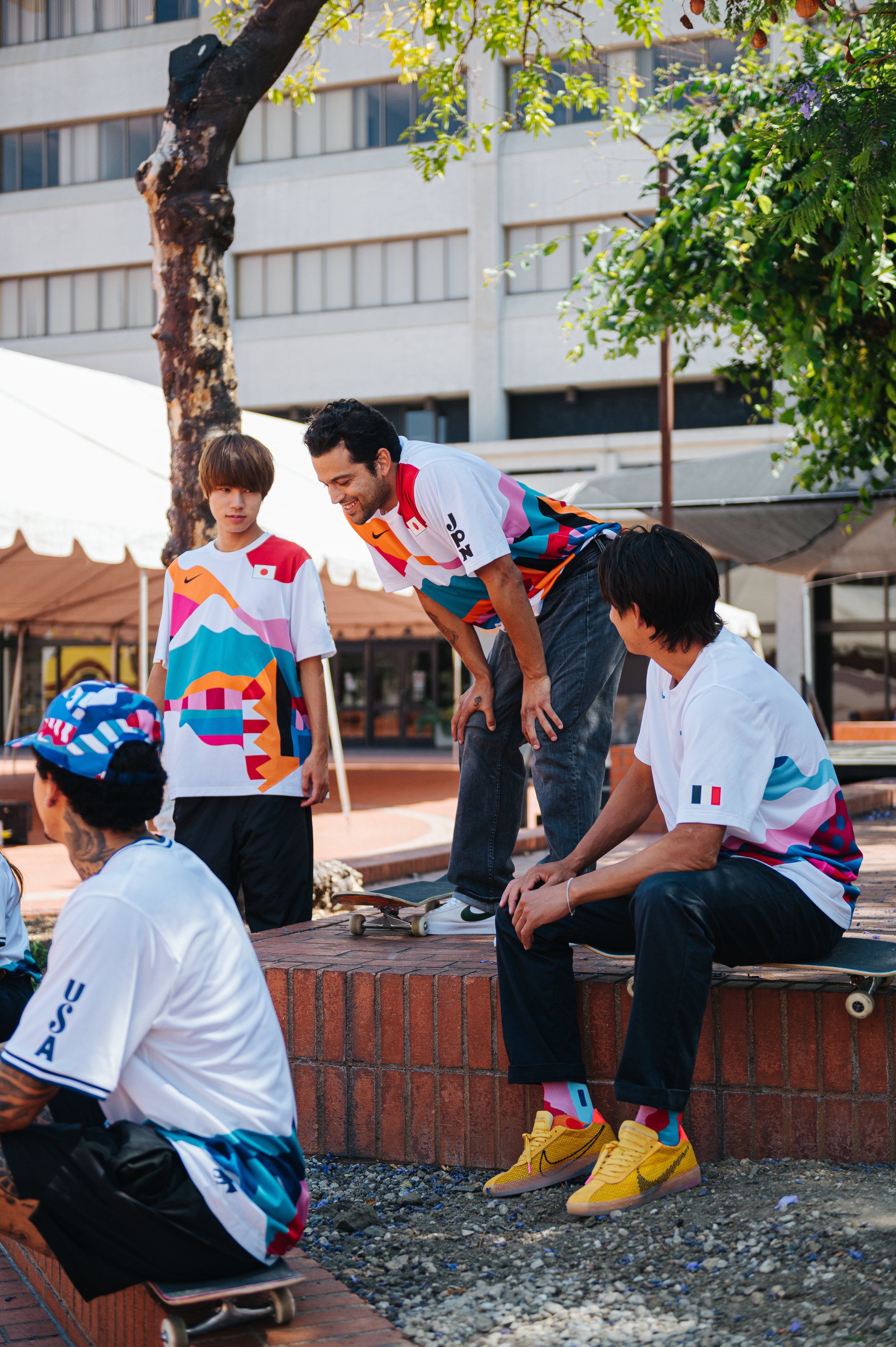
48 teams. Billions watching. This summer, the beautiful game takes its biggest stage ever. A global moment united by rhythm, to celebrate the tournament, Nike SB and nine key North American skate shops come together to pursue “La Más Fina.”
Won on the pitch and fueled by the finest, the Nike SB FC collection pays homage to movement, rhythm, and the handmade craft of Mexico and the United States.
We spoke to Nike SB Lead Graphic Designer Steven Gonzalez about the collection's inspiration and how the team coalesced to reflect a fan-first perspective.


Skateboarding and football culture are connected by fandom. It’s that idea that anyone can find a way to participate and put their stamp on something they care deeply about. How did the design team begin thinking about customizing the collection?
STEVEN GONZALEZ: The speakers. We always lead with the sounds of the streets. It all started when we turned on the speakers, Cumbia hit the sound system, and we knew that was it. The shared love of Cumbia between both co-host countries, a rhythm that ignores divides.
Once you had that conceptual north star, what was the next exploration?
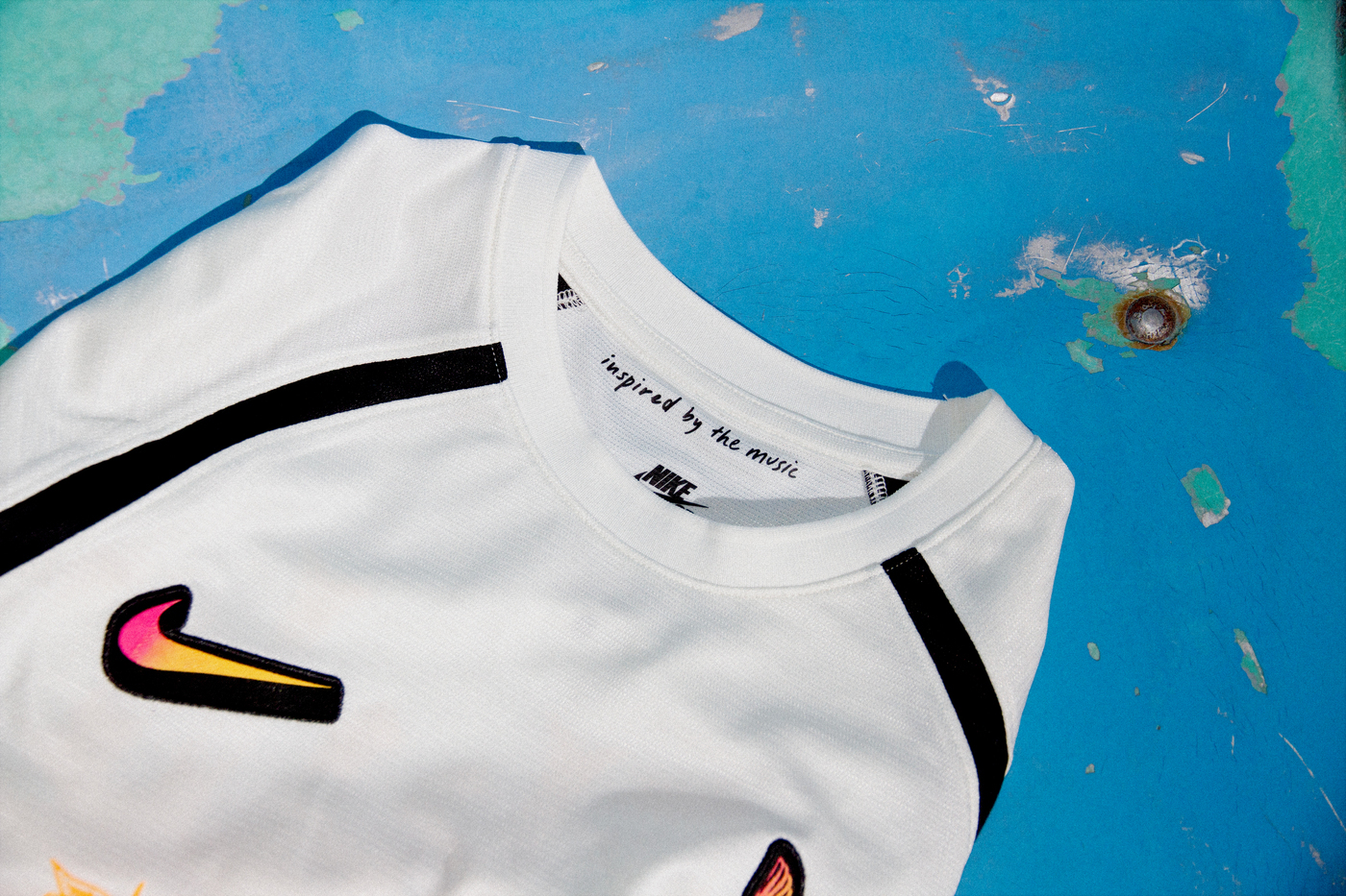
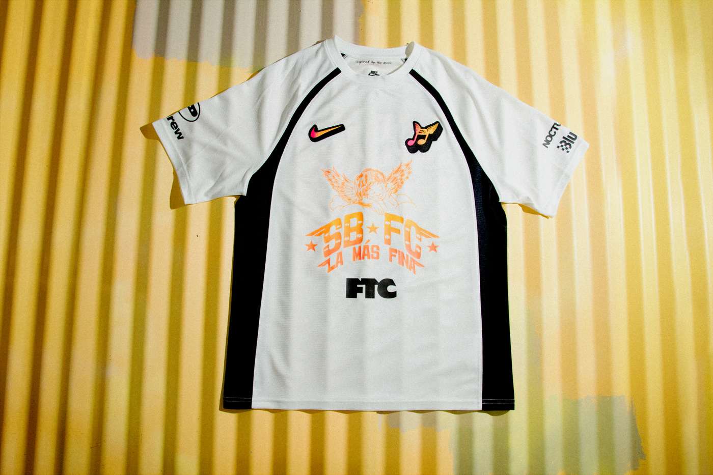
First things first, the mascot. I’ve always seen SB as real sweethearts. It only felt right to bring our little Angelita to the kit, paying an endearing homage to LA with that classic hand-style stippling. Then it was straight to our personal archives, where we found scans of our favorite Cumbia flyers, signage from both host cities, and iconic jerseys with sponsorships and references.
Can you talk about how you distilled all those references and touch points to create a collection that honors the source material?
The concept unveiled itself organically. Being born and raised in Southern California, my reference points were in my back pocket. The world of rótulos and street posters is home to me. There's a nice mix of high and low brow in those designs, which really parallels nicely with SB.
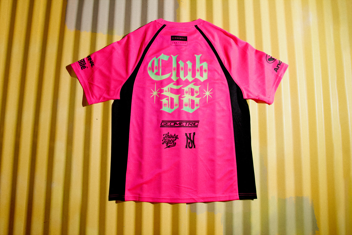
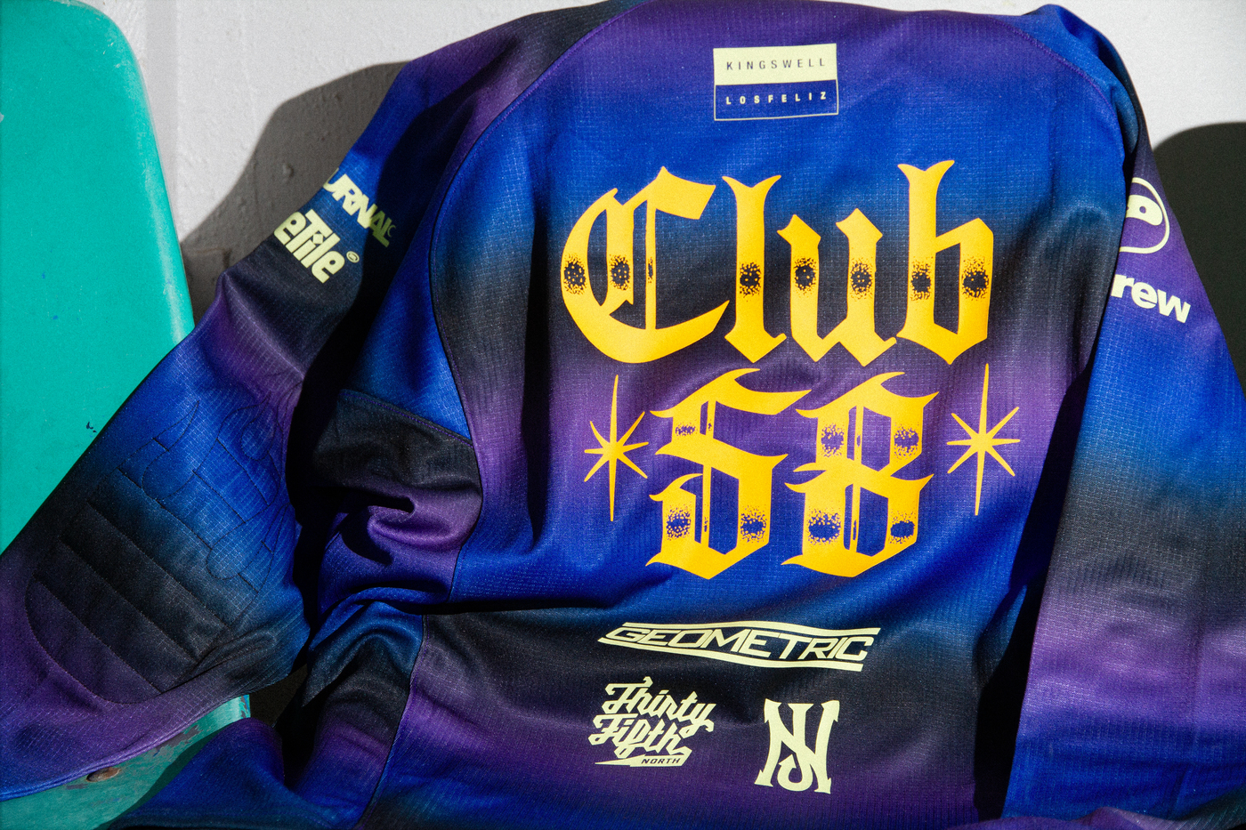
Back to our football references, we were all obsessed with the sponsorships. Those sponsorships are sometimes more iconic than the actual kit itself. Our opportunity was to highlight nine key Club 58 shops and have them as our sponsors. Having the “Club 58” type drawn in blackletter was a nice touch.
![]()
The heart beats for a reason—it’s the BPM of life.
- Steven Gonzalez
How did that all translate into the color choices?
The color team killed it. It’s no surprise that color can leave an everlasting impression and we wanted to be intentional with our palette. The higher the saturation, the more vibrant the vibe.
With so many of the graphic elements coming from hand-painted signs and typography, how did you balance raw and refined in the graphic treatments?
Looking into the deep, rich history of rótulos in Mexico and Los Angeles specifically, it was important to honor the craft and have all logotypes hand-drawn. From tracing paper to digitally vectorized was the only way to go.
From hand stippling our Club 58 in Old English, inspired by the craftsmanship of Chicano tattoo culture, to drawing SB FC as our love letter to Cumbia logos. The typographic elements all came together and felt natural on kit.
Is there an intentional connection between music or even the rhythm of sport and design symmetry?
Absolutely. The heart beats for a reason—it’s the BPM of life.
Can you discuss the specific nods to Mexican culture throughout the design, specifically Cumbia music?
Cumbia has an extensive sound and history in Latin America. From Norteñas, Sonidera, Rebajada to Tecnocumbia, there’s a little something for everybody. It was music I grew up listening to at parties, at the park, at work, on the radio, or in the office. That rhythm’s always felt like home.
Do you have a favorite detail from any of the pieces?
“Support Your Local” on the inside of the crest is so sick.
The SB FC collection releases in select Skateshops July 1 and SNKRS July 7. Click HERE to find a shop near you and get notified in SNKRS.